
Best bike decals for customization are the fastest way to make a stock frame feel like “yours”, but the wrong vinyl, finish, or sizing can look cheap fast, peel at the first wash, or clash with your paint.
If you want a clean, intentional look, you need to pick decals the same way you’d pick components: match the use case, understand materials, and plan placement before you stick anything down.
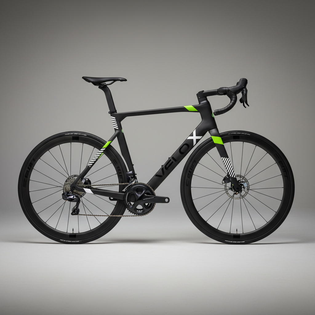
This guide covers what actually matters when shopping, a quick self-check to avoid the common mistakes, and practical application tips so your graphics look crisp rather than “weekend craft project”.
What “good” bike decals really mean (beyond the design)
Most people shop by color and style, then get surprised when edges lift, the print fades, or the finish looks off in sunlight. Quality shows up in a few specific places.
- Vinyl type: Cast vinyl usually conforms better to curves and tends to last longer than cheaper calendared vinyl, especially on complex tubes.
- Adhesive: Look for outdoor-rated adhesive; some are repositionable for easier alignment, which matters if you’re not applying daily.
- Finish: Matte hides small imperfections, gloss pops more but shows bubbles and scratches more easily, reflective adds night visibility but can look busy.
- Ink/print method: Printed gradients and photos can look amazing, but solid-color cut vinyl often ages more gracefully.
- Clearcoat compatibility: Some riders clearcoat over decals for a “painted-on” look; check product guidance first since not all vinyl likes solvents.
According to 3M, surface preparation and proper squeegee technique are major drivers of vinyl film performance, which is a polite way of saying the same decal can look great or terrible depending on application.
Types of decals you’ll see most often (and when each makes sense)
There isn’t one universal “best” style, because commuters, MTB riders, and show-bike builders care about different tradeoffs.
Cut vinyl logos and shapes
Great for clean branding, names, simple stripes, and “factory” vibes. If you want the most convincing OEM look, this is usually the safest bet.
Printed graphic kits
Better for complex art, gradients, and multi-color illustrations. Many riders choose these for full-frame themes, but durability depends heavily on laminate quality.
Reflective decals
Often a smart commuter choice because they add passive visibility at night. Just keep placement tasteful so the bike doesn’t read like a rolling safety vest.
Protective film with styling
Some kits combine clear frame protection with subtle patterns. If you ride gravel or MTB, this can be a two-birds solution: scuff resistance plus personalization.
Quick self-check: choosing the right decals for your bike and riding style
If you want to land on the best bike decals for customization for your setup, answer these fast. You’ll narrow choices more than scrolling product pages for hours.
- Where do you ride? Rain, road salt, and frequent washing usually demand better vinyl and laminate.
- Frame material? Carbon and painted aluminum are typically straightforward; raw or textured finishes can be trickier for adhesion.
- Curves and cable routing? Aggressive aero shapes and internal routing ports mean you want more conformable vinyl and smarter placement.
- Goal look? OEM-clean, loud statement, stealth accents, or safety-first reflective.
- How long do you want them on? Temporary seasonal graphics vs a multi-year build changes what “best” means.
One more reality check: if you change components often, decals that are easy to remove cleanly can be more valuable than ultra-permanent adhesive.
Comparison table: decal options that fit most customization goals
Use this as a buying filter. You can still pick any brand you like, but these criteria keep you out of the “looks good in the listing” trap.
| Decal type | Best for | Durability (typical) | Application difficulty | Notes |
|---|---|---|---|---|
| Cut cast vinyl | Clean logos, names, stripes | High | Medium | More forgiving on curves, tends to age well |
| Cut calendared vinyl | Budget accents, short-term themes | Medium to low | Medium | Edges may lift sooner on tight radii |
| Printed + laminated kit | Artwork, gradients, multi-color designs | Medium to high | Medium to high | Laminate quality matters more than the print |
| Reflective vinyl | Commuting, night visibility | Medium | Low to medium | Best as accents on fork, stays, rims, helmet |
| Clear protective film + accents | Gravel/MTB scuff zones | High | High | Great value when protection is also the goal |
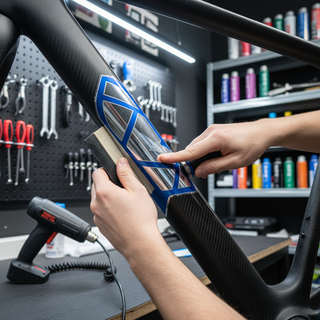
How to apply bike decals cleanly (step-by-step, no drama)
Best bike decals for customization still look rough if alignment is off or trapped air gets sealed in. This is the workflow that tends to produce a “shop applied” finish.
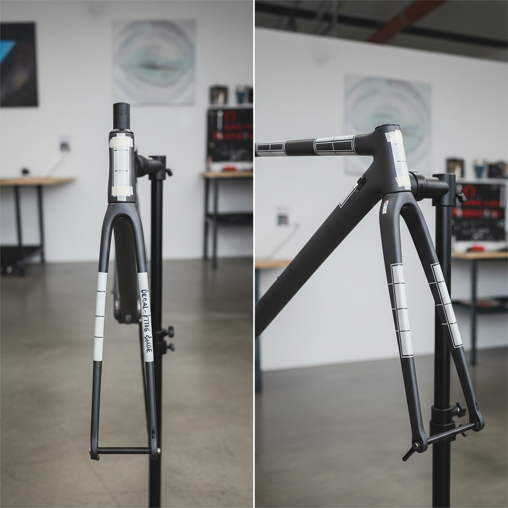
1) Plan placement before you peel backing
- Clean the frame visually: stand back, find natural lines, avoid interrupting logos and welds.
- Use painter’s tape to mock the decal position, take a photo, then decide.
- Measure from fixed reference points like bottle cage bolts or tube junctions, not “by eye”.
2) Prep the surface properly
- Wash, then degrease with isopropyl alcohol on a lint-free cloth.
- Avoid applying right after using waxes or silicone sprays, adhesion may suffer.
- Let the frame reach room temperature; cold garages make vinyl stiff.
3) Apply with controlled pressure
- Start from a center line and work outward with a squeegee or soft card.
- On curved tubes, gentle heat helps the vinyl relax, but too much heat can distort.
- If you trap a bubble, lift and re-squeegee if the adhesive allows; tiny bubbles sometimes dissipate over time.
4) Post-apply “set” time
- Give it at least a day before heavy washing or wet rides, if you can.
- Press down edges once more after 15–30 minutes, that’s where failures usually start.
According to Avery Dennison, using appropriate surface prep and application pressure improves adhesion performance for pressure-sensitive films, which lines up with what riders see in the real world.
Mistakes that make decals look cheap (and how to avoid them)
Most “bad decal jobs” aren’t about taste, they’re about a few predictable errors that add up.
- Ignoring scale: Small decals on oversized tubes look lost, huge decals on skinny tubes look crowded.
- Too many fonts: One typeface plus one accent style is usually enough for a cohesive build.
- Placing on high-wear edges: Chainstay and heel-rub zones chew up graphics unless you use protective film.
- Applying over dirt or polish: Adhesive sticks to contamination, not the paint.
- Mixing finishes randomly: Matte decals on gloss paint can look premium, but five finishes at once rarely does.
Also, resist the urge to cover every tube. A little negative space often reads more expensive.
When you should consider a pro shop (or at least ask for help)
If you’re working with an expensive carbon frame, complex wrap-style kits, or you want decals under clearcoat, it can be worth talking to a bike shop or a local wrap/sign professional. Not because it’s impossible at home, but because a small mistake can turn into hours of cleanup.
- Deep compound curves on aero frames, where stretching vinyl evenly takes practice.
- Paint protection film installs, since trapped contamination is hard to fix once set.
- Safety concerns: If you’re adding reflective elements for night riding, you may want guidance on placement and visibility; for riding safety questions, consider checking local regulations and asking a qualified professional.
Key takeaways (so you can choose fast)
- Material beats art: cast vinyl and good adhesive usually matter more than the trendiest pattern.
- Match decals to riding reality: commuters and MTB riders punish edges, choose accordingly.
- Plan placement like a design: tape mockups and measurements save you from crooked regret.
- Application makes or breaks the look: clean surface, controlled pressure, patience on edges.
Conclusion: pick a style, then execute it cleanly
The best bike decals for customization are the ones that fit your riding conditions, match your frame’s shapes, and install without visible stress lines or lifting edges. Pick one clear theme, buy decent materials, and spend an extra 20 minutes on layout and cleaning, that’s usually the difference between “custom” and “messy”.
If you want a simple next step, choose one high-impact area to start, like a downtube logo or subtle reflective accents on the fork and stays, then live with it for a week before you add more.